"Until after the middle of the nineteenth century, when the development of mechanized bookbinding methods first diminished and afterward virtually did away with the need for their services, hand bookbinders utilized marbled paper and the marbler's craft to embellish many of the books that were bound during the previous several centuries. Marbled papers were employed outside the book trade as well to adorn a great many products of everyday use.
They served, for example, as wall coverings; as linings for the interiors of trunks, boxes, wallets, musical instrument cases and other containers; for covering boxes and other receptacles; as ornamentation in the panels of cabinets, furniture, and even harpsichords; as wrappings for toys, drug powders, and other consumer goods; for enclosing blank books used for writing, and for other stationary purposes; and as shelf papers for lining cupboards and cabinets and for many home-decorating purposes.
Despite their prior popularity and extensive employment, marbled papers and the marbler's craft have remained the most obscure, and least investigated and understood, of all aspects of book arts. [..] For about two and a half centuries after its introduction into Europe about the year 1600, marbling was one of the chief means available for producing the colored papers used in bookbinding and other decorative work. It performed a similarly important role in the day-to-day life of the Near East, where the art was brought to perfection even earlier and used in conjunction with Islamic bookbinding, calligraphy, iconography, fine arts, and even administrative uses. In both the East and the West, large numbers and many generations of people spent their working lives in the production of marbled papers needed for these various purposes."
From the introduction to: 'Marbled Paper: Its History, Techniques, and Patterns' 1990 by Richard J Wolfe, widely regarded as the leading authority on marbling. Wolfe is mentioned as a reference in the notes below; paraphrased from the source UW site.
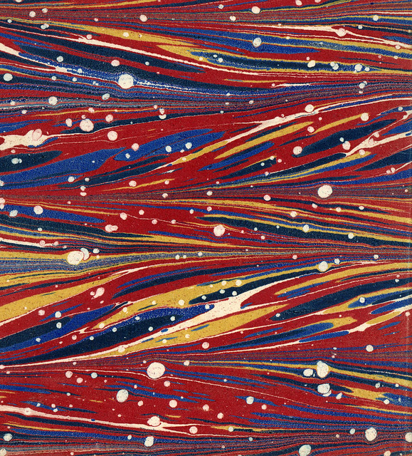
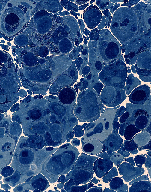
Vintage 19th c. marbled paper, antique straight pattern
Historically Wolfe suggests that the Antique straight is a pattern seen at least as early as the 17th century. This decorative arrangement is created by first completing a feather pattern. Then, a shower of fine (usually white) colour dots would be sprinkled over the entire bath.
Collection Notes [relates to all of the images below]: The flat sample from which this photo was scanned is a salvaged endsheet. There is no record of the original item from which these endsheets were taken, so the creation date is a best estimate, using Wolfe as a guide.
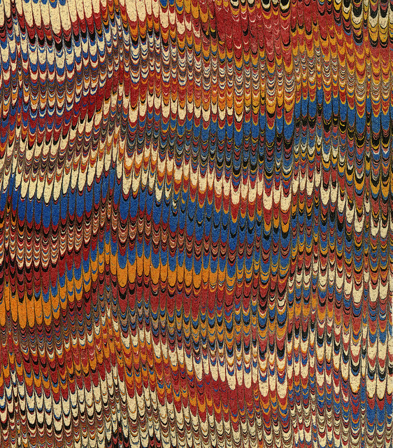
Vintage 19th c. marbled paper, Turkish pattern
Historically, this is the oldest of Western marbled patterns and dates back to as early as the middle part of the 15th century. Because this is the earliest (and simplest) example, it provides a base or jump off point for a large number of other patterns.
The pattern is created when one or more colours are thrown onto the surface of the bath using a marbling brush. The first colours thrown tend to constrict as other follow and can become the 'vein' colours for the latter thrown inks.
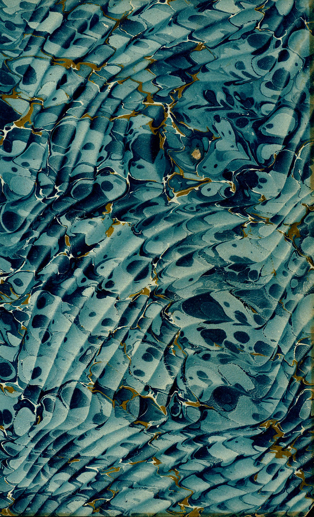
Vintage 19th c. marbled paper, Turkish on Stormont pattern
The stormont* pattern is a rare effect in which turpentine is added to the blue colour causing it to break up into a fine network of lacy or flakey spots.
Vintage 19th c. marbled paper, Gloster pattern
Gloster is similar to and often mistaken for a Stormont pattern. They both require a dispersant such as turpentine to cause their distinctive white (open) spots. The difference is that the Stormont pattern, overall, appears to be more like a Turkish pattern in that the ink has been mixed with the dispersant to cover the entire surface, whereas the Gloster looks more like a Zebra pattern where the dispersant has only been mixed with a single colour, making the spots distinctive from the other colours used.
The pattern is created by starting with a Turkish base, then a comb with one set of teeth is drawn across the bath twice vertically (or horizontally), once in either direction with the second pass halving the first. Then one or more colours of ink mixed with a dispersant are sprinkled onto the bath, causing those last spots to have open, very fine spots inside them.
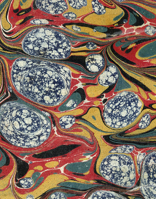
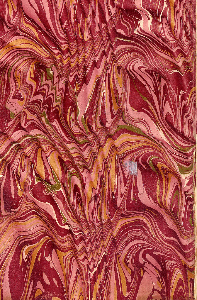
Vintage 19th c. marbled paper, Spanish moiré on Turkish with gold vein pattern
The pattern is created by making a Turkish pattern where the first colour used is gold. As further colours are dropped to complete the Turkish pattern, the gold constricts into veins. Then a paper, which has been folded in half is laid onto the bath, moving slightly from side to side to create the curvilinear gradations typical of this pattern.
Vintage 19th c. marbled paper, Spanish moiré on Serpentine with gold vein pattern
As above.
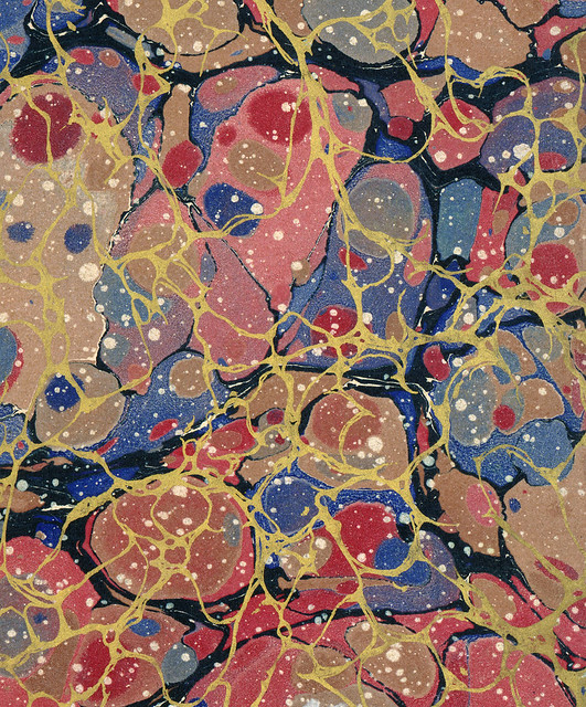
Vintage 19th c. marbled paper, Nonpareil pattern
Nonpareil [Fr.] means ‘matchless' or ‘unrivalled.' This pattern is related to the Wide comb (Arch) pattern as well as the Old Dutch pattern. All are variations of one another and are often mistaken for each other. The major differences are very difficult to pinpoint, but seem to stem from the size of intervals the last comb's teeth are set in.
This pattern is created when the desired colours are dropped sequentially onto the bath using some sort of implement to regulate the drop sizes. According to Miura* a comb with one set of teeth set at intervals of 15-30mm is drawn through the bath horizontally, once in either direction with the second pass halving the first. Then another comb with teeth set at 2-3 mm is drawn once across the bath vertically (or horizontally).
*'The Art of Marbled Paper: Marbled Patterns and How to Make Them' by Einen Miura, 1988/1991.
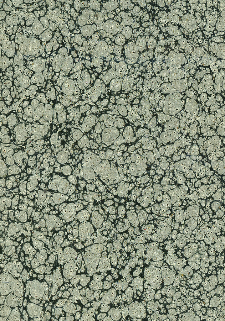
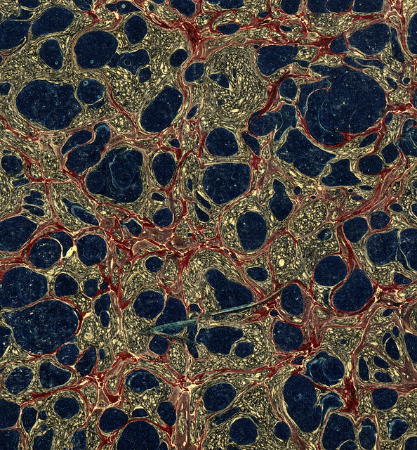
Vintage 19th c. marbled paper, Schrottel pattern
The pattern was created in Germany in the early part of the 18th century. It has many different spellings but Miura suggests in his spelling that the pattern's name is derived from the German word Schrot which means 'small shot' or 'small grain.'
The pattern is created by starting with a Turkish base. Then, a mixture is thrown onto the bath whose reaction with the previous colours causes the dark spots with white halos to appear, that are reminiscent in look to tiny stones. This mixture is made up of ox gall and oil. The primary colour for this example is black.
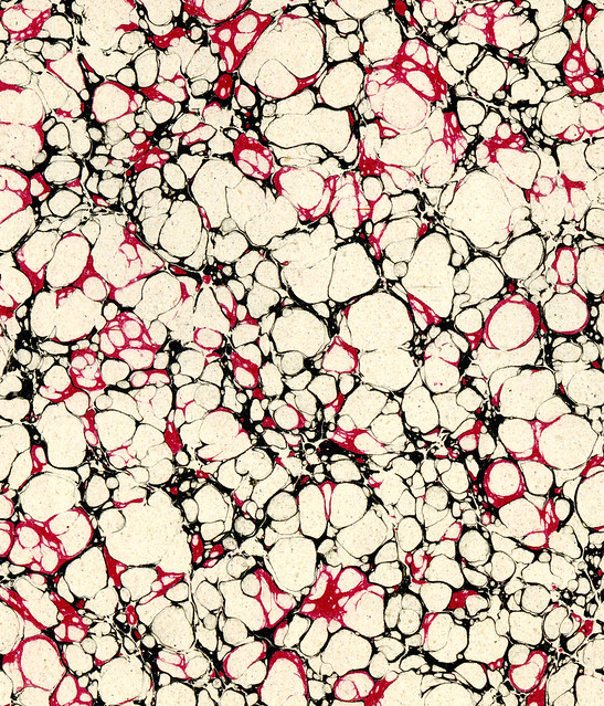
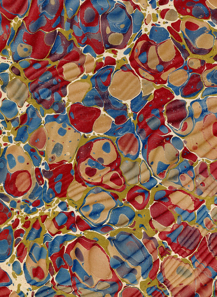
Vintage 19th c. marbled paper, Italian pattern
This pattern was created in Italy near the end of the 18th century. Its name is likely based equally on it nation of origin and the fact that it so closely resembles the actual stone, Italian marble.
This pattern is created when, after however many colours desired are thrown onto the bath, a dispersant is sprinkled over the entire bath in fine dots. These tiny drops of dispersant cause the previously thrown colours to constrict into tiny veins. Miura suggests that the dispersant might be made up of a mixture of soap, spirits and ox gall and then sprinkled over the bath through fine wire mesh to maintain the size of the dispersant drops. These constricted veins cause the colours to appear as they would in marbled stone.
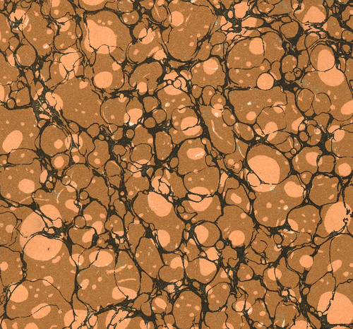
Vintage 19th c. marbled paper, Italian Overprinted on Turkish pattern
Normally, the Turkish pattern is created when one or more colours are thrown onto the surface of the bath using a marbling brush. The first colours thrown tend to constrict and become the 'vein' colours for the latter thrown inks. However, this particular sample has been printed with a lithographic process for both patterns as was popular towards the end of the 1800's.The primary colours for this sample are light brown, peach, and black.
Vintage 19th c. marbled paper, Spanish moiré on Turkish with Gold vein pattern
The pattern is created by making a Turkish pattern where the first colour used is gold. As further colours are dropped to complete the Turkish pattern, the gold constricts into veins. Then a paper, which has been folded in half is laid onto the bath, moving slightly from side to side to create the curvilinear gradations typical of this pattern. [repeating description from up the page]
Vintage 19th c. marbled paper, Gold vein Overprinted on Turkish antiqued pattern
Though related in terms of end appearance, an 'overprint' is not the same process as 'Double marble' according to Miura. A double marble is created when a single paper has been through the marbling process twice where both patterns are on top of one another. An overprint is created when a paper, already marbled, is then printed on top of another pattern using a lithographic process.
This pattern is created by first completing a Turkish antiqued pattern ('antiqued' refers to any pattern where a last colour, usually white, is finely sprinkled over the entire bath). Then after that paper has been dried, the marbled side would be printed over with a Gold vein pattern (Italian pattern using metallic ink) using a lithographic process.

Vintage 19th c. marbled paper, Gold vein Overprinted over Spanish moiré on Turkish pattern
Similar to above, this pattern is created by first completing a Spanish moiré on Turkish pattern. Then after that paper has been dried, the marbled side would be printed over with a Gold vein pattern (Italian pattern using metallic ink) using a lithographic process.
The history of marbling is fairly obscure. It is thought that the decoration first appeared in Japan by at least the early 12th century, from a process known (still) as Suminagashi ('sumi' means ink and 'nagashi' means floating, thus 'a pattern formed by floating ink'). The craft may have arisen in China independently or was imported from Japan very early on in the piece. Certainly, the inference in all the references is that a marbling technique was first practised in Japan.
Perhaps a century later, marbling appeared in, or near, Afghanistan, becoming an art form of the Persian and Ottoman worlds, centred in Turkey. Again, the marbling process may have been imported from the far East via the Silk Road trade route or it arose independently. The distinct Turkish marbling technique is known as Ebru and even the origin of that word is contentious, connoting either cloud art or water surface in Farsi or a related regional dialect.
The Suminagashi and Ebru forms of marbling are simplistic and rudimentary in comparison to the diverse and technically precise art that emerged later in Europe. In this case it is known that the technique was transplanted from Turkey to France, Italy and Germany in the 15th and 16th centuries, where a much larger body of craftsmen developed the technique.
Incidentally, the first mention of the marbling technique in western literature was by Athanasius Kircher in his 1646 book, 'Ars Magna Lucis et Umbrae'.
- All images above come from the University of Washington Decorated and Decorative Paper Collection.
- 'Marbled Paper: Its History, Techniques, and Patterns' 1990 by Richard J Wolfe
- 'The Art of Marbled Paper: Marbled Patterns and How to Make Them' 1991 by Einen Miura.
- Under the Covers: the Hidden Art of Endpapers from the collection of the Salem Athenæum.
- Art of Ebru.
- 'Marbled Paper' by Joel Silver, 2005 in Fine Books & Collections Magazine.
- Paper marbling at Wikipedia.
- The Lada-Mocarski Decorated Paper Collection at the Folger Shakespeare Library.
- Decorated paper and papermaking at the Dutch Royal & National Library.
- The world of Japanese Marbling: Suminagashi & Suimonga.
- The Decorated Paper post on Metafilter was particularly helpful.
- Youtube Playlists: Marbling Set One & Marbling Set Two.
- Marbled Papers set at Flickr by MyHandBoundBooks.
- The Indiana University exhibition site: From Pen to Printing Press: Ten Centuries of Islamic Book Arts, contains a page/series of images on Turkish marbling.
- Previously: Bookart.
- Consider : The Roumi Art Institute in Rotterdam for your paper marbling & calligraphy needs [sponsor]