Thursday, January 31, 2008

Ornamental Typography

Mauro Poggi 1750 ornamental letter


Mauro Poggi 1750 ornamental letter


Mauro Poggi 1750 ornamental letter


Mauro Poggi 1750 Figural letter


Mauro Poggi - Alfabeto di Lettere Iniziale - titlepage

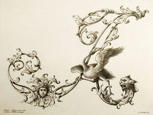
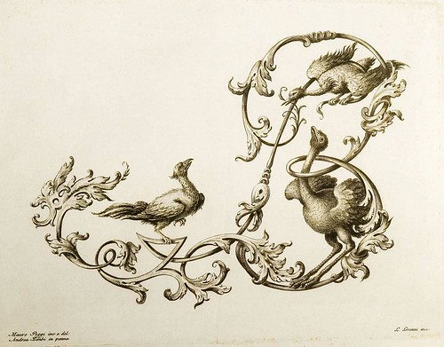
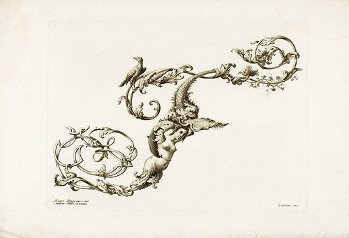
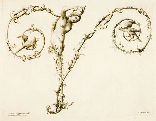
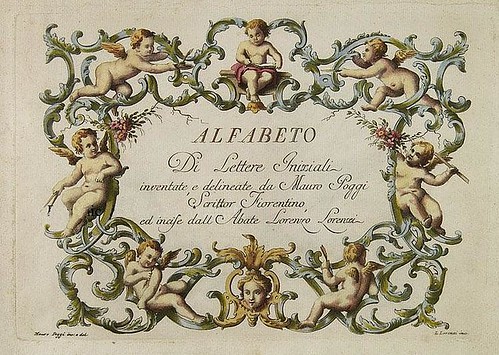
'Alfabeto di Lettere Iniziali' (c. 1730) from designs by Mauro Poggi.

[The edition above, from the Austrian Musuem of Contemporary Art (link below),
dates from c.1750, and the cover page - sans watermark - comes from here]
"[T]his lovely engraved oblong folio [is] one of the most delightful 18th century alphabets in the high rococo style. Reflecting the style of the early 18th century engraver, Giambattista Betti, the design of each splendid plate features an elegant cursive capital form of one of the two dozen letters of the 18th century alphabet (there were 24 letters, rather than 26, because i and j were the same letter, and because there was no w).

The capitals are elaborated with scrolls and flourishes and then inhabited by satyrs, mermaids, Medusa heads, birds, cats, dogs, snakes, and other creatures. The letters were designed by Poggi, drawn in ink by Andrea Bimbi, and engraved by Lorenzo Lorenzi. Bonacini characterizes it as a precious collection showing a surprising richness of imagination. Given the work’s obvious esthetic achievement and inclusion in the major bibliographies of writing books, one would expect that Poggi would have produced additional works, but this item is the only one he is known to have done."


Johann Merken, Liber Artificiosus Alphabeti Maioris 1782 c


Johann Merken, Liber Artificiosus Alphabeti Maioris 1782 d


Johann Merken, Liber Artificiosus Alphabeti Maioris 1782 b


Johann Merken, Liber Artificiosus Alphabeti Maioris 1782 a


Johann Merken, Liber Artificiosus Alphabeti Maioris 1782


Johann Merken, Liber Artificiosus Alphabeti Maioris 1782 e

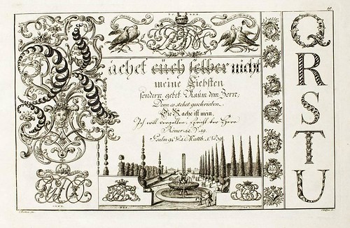
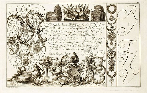
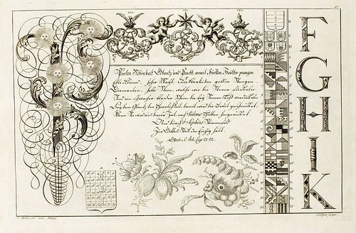
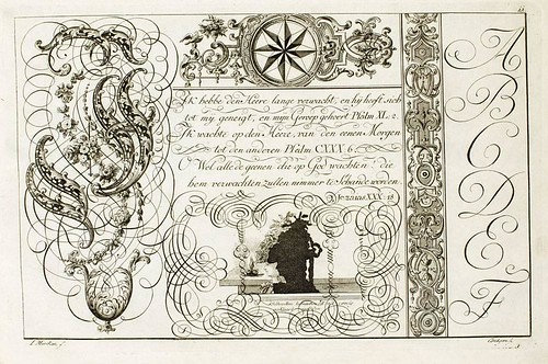
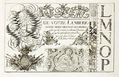
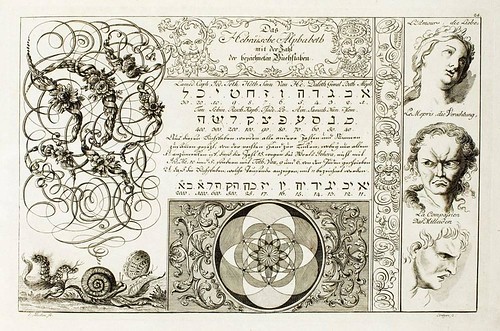
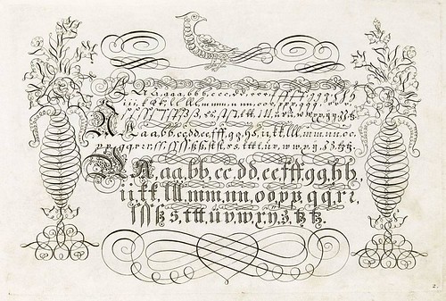
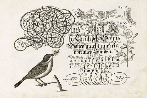
'Liber Artificiosus Alphabeti Maioris' (1782-1785)
designs by Johann Merken, engraved by Heinrich Coentgen

The first and only edition (published in two parts) of this rarely complete calligraphy book included fifty six engraved plates. Besides the elaborate alphabets there are example writing styles, portraits, silhouettes (Lavater purloined one of the plates - not shown - for his 'Physiognomy'), monograms, calendars, fantasy geometrical and architectural figures, emblems, genealogical tables and ornamental letters. I understand (from wonky translations) that the letterpress text included recipes for making different inks.


Johann Losenawer 1739 f


Johann Losenawer 1739 e


Johann Losenawer 1739 c


Johann Losenawer 1739 b


Johann Losenawer 1739 a


Johann Losenawer 1739

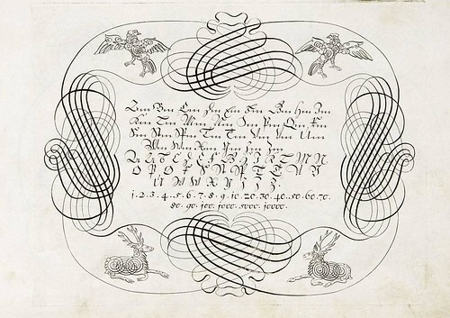
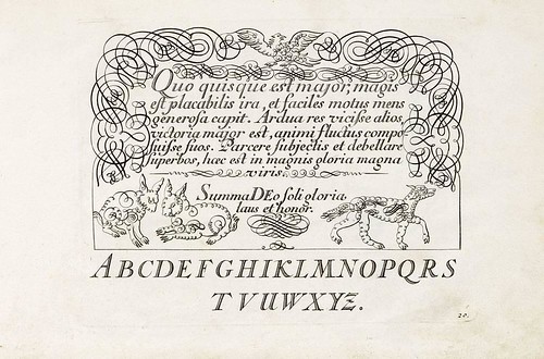
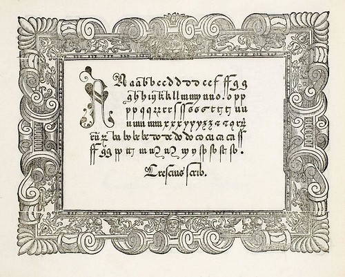
The only information I can find about the above plates is that they come from a book entitled 'Vorschrift Deutsch-Lateinisch und Franczösischer Schriften Geschrieben' by Johann Jacob Losenawer (Losenawern or Losenauer), published in Stuttgart in 1719 (the above calligraphic flourishes are from a 1739 edition).


Hans Sebald Beham 1554 (Putte mit Spruchband mit Alphabet)

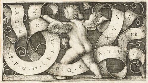
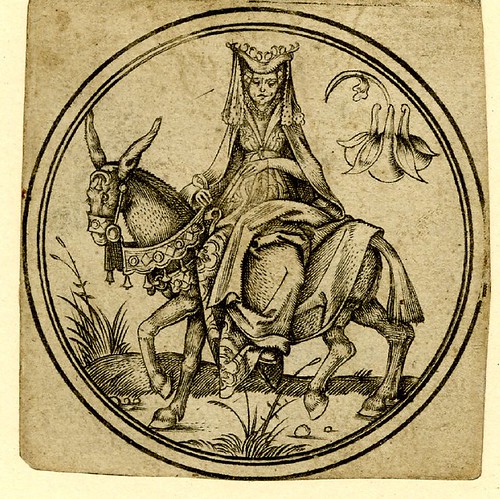
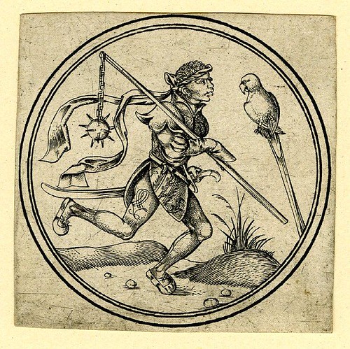
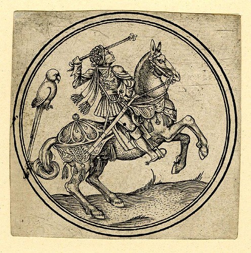
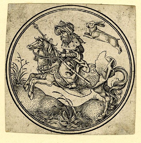
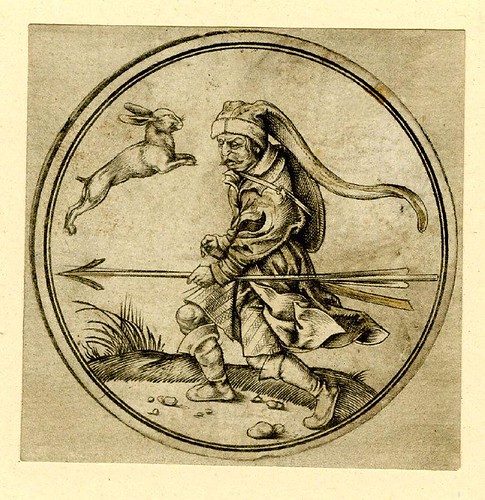
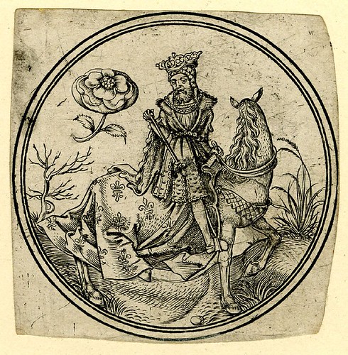
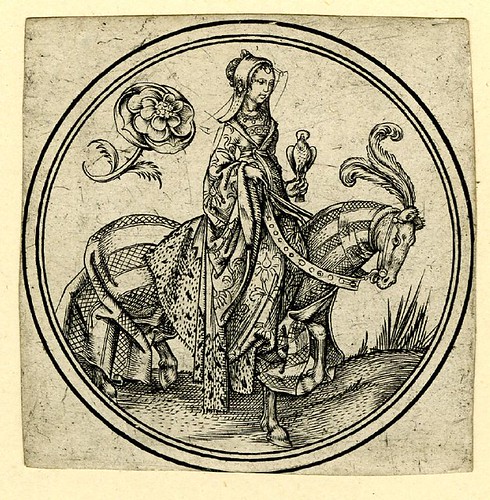
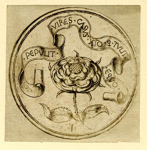
Alphabetic ribbon vignette with putto by the prolific
German printmaker/artist, Hans Sebald Beham, 1564.


Francesco Giovanni Cresci - Il Perfetto Scrittore - 1570 b


Francesco Giovanni Cresci - Il Perfetto Scrittore - 1570 a


Francesco Giovanni Cresci - Il Perfetto Scrittore - 1570

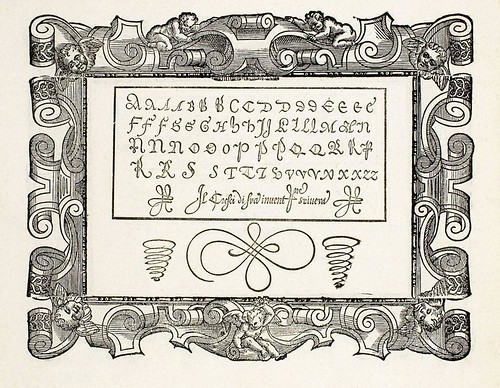
The Vatican scriptor, Gianfrancesco Cresci of Milan, heralded the onset of the Baroque by categorically rejecting what he considered were the useless adornments to some of the alphabets produced in the 1540s by the Master calligrapher, Giambattista Palatino*. Palatino responded by adopting letterforms similar to Cresci's (whose first work was published in 1560) only to be accused by Cresci of lacking the necessary skills to produce the set himself, instead hiring an engraver for the work. It was quite the calligraphy/typography scandal of the 16th century. [I believe the modern scholarly consensus, from manuscript comparisons, vindicates Palatino]

The above images are from one of the classic books on letterforms: Cresci's 'Il Perfetto Scrittore', published in 1570. One of the alphabets was the inspiration for the typeface, 'Cresci', designed in 1996.

In passing, I came across the following..


Bertozzi Antonello 1604

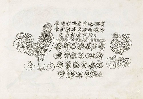
Ornamental calligraphy from a suite of prints by Antonello Bertozzi, 1604. I didn't discover any information about the artist, but he did produce a fabulous book on lace patterns, displaying similar styles to the embellishments above, available at Archive.org - I may have to revisit that one in the future.


Unless otherwise noted, all the above images come from the fantastic Ornamental Prints Online site - a collaborative database between The Museum of Decorative Arts in Berlin, The Museum of Decorative Arts in Prague and The Austrian Museum of Contemporary Arts (MAK).

Although there is extensive information in english (top right), the above images (all extensively background cleaned) were generated by searching on 'alphabet' from the search box (top left) at the German interface (>200 results across the institutions). For some reason the same search using the English interface only gives results from one of the museums. In fact, all of the above images are from MAK. The Prague images were prohibitively watermarked in the larger versions and the Berlin images are either digitally watermarked, degrading their quality in the larger jpegs, or are just poor quality files. Nevertheless, this is a wonderful resource site in which to browse.

Thanks very much to Tia for writing to tell of her recent visit to the exhibition in Vienna: 'From Grotesquerie to the Grotesque', which led to the database.

Some of my favourite entries at the now retired Giornale Nuovo were on unusual alphabets/letterforms. See: one, two, three, four, five, six, seven (did I miss any?)

Monday, January 28, 2008

Ptolemy Map World

Ptolemy's world map


Taprobana (Sri Lanka) map


Ptolemy Cosmographia 1467 - Sri Lanka text


1467 map of Spain and Portugal


Black sea states - Ptolemy map


North Central Africa and the Mediterranean Sea


Ptolemy map of South East Asia 1467


Ptolemy Cosmographia 1467 - Ethiopia text


Ptolemy  Cosmographia 1467 - Germany text


Ptolemy  Cosmographia 1467 - North Africa a text


Scandinavia map 1467
"The work of ancient Greek culture 'Geografice hyfegesis ...' by Claudius Ptolemy, an astronomer and geographer of Alexandria was written around 160 A.C. It influences the knowledge of the world and the self-awareness of Europeans for nearly 1500 years. The text in the presented BOZ codex (Zamoyski Library) is the fourth edited version of Geography authored by a monk Donnus Nicolaus Germanus with the later added title Cosmographia Claudii Ptolemaei. It contains, in the first volume the text of the work dedicated to pope Paul II and in the second volume 27 maps prepared on the basis of information contained in the work by Ptolemy and three "new" maps drawn according to the state of knowlegde from the beginning of the 15th century. One may find in it very significant information about Europe and the whole ancient world from the times before the discovery of America.

It is the only preserved copy of the fourth edited version, which is why it is of immense interest to historians. It has not been published thus far, only pre-war facsimiles of two maps quotes in several publications are known. The whole codex is very richly decorated and gilt-edged. Both maps and their descriptions are within frames featuring floral motifs, at the beginning of each description are gilt initials in the bianchi ghirari style. The presented map of the world, stretching from Western Ocean to China and from the sources of Nile to Greenland is at the same time image of the Earth in the boundless outer space. It is surrounded by personifications of 12 winds, the luminous oval in gold, pinkish and blue symbolizes the elements which make up the Universe: earth, air, fire and water. The other hemisphere was not presented."

Friday, January 25, 2008

Apokalypse

Apokalypse 57v


Apokalypse 60v


Apokalypse 69v


Apokalypse blockbook manuscript 72v


Apokalypse block book manuscript 74r


Apokalypse blochbuch 75v


Apokalypse 77r


Apokalypse 83r


Apokalypse 15th century mss 92r


Apokalypse 93v


Apokalypse 95r


Apokalypse 99v


Apokalypse 101r


Apokalypse 102v


Apokalypse 105v

"The Apocalypse, or Revelation to John, the last book of the Bible, is one of the most difficult to understand because it abounds in unfamiliar and extravagant symbolism, which at best appears unusual to the modern reader. Symbolic language, however, is one of the chief characteristics of apocalyptic literature, of which this book is an outstanding example. [..]

The Book of Revelation cannot be adequately understood except against the historical background that occasioned its writing. Like Daniel and other apocalypses, it was composed as resistance literature to meet a crisis. The book itself suggests that the crisis was ruthless persecution of the early church by the Roman authorities; the harlot Babylon symbolizes pagan Rome, the city on seven hills. The book is, then, an exhortation and admonition to Christians of the first century to stand firm in the faith and to avoid compromise with paganism, despite the threat of adversity and martyrdom; they are to await patiently the fulfillment of God's mighty promises."
=-=-=-=-=-=-=-=-=-=-=-=-=-
"The Apocalypse is a xylographic book [see 'Totentanz Blockbook' for more info/links on this printing technique] printed from full-page blocks carrying two horizontal pictures, and with the texts usually cut in framed rectangles within the picture borders. The images are done in outline with no shading or cross-hatching and there is no background landscape. There were six editions of the blockbook, the last three probably German. All have forty-eight leaves, except the third which has fifty and a revised text. It was copied from the earlier editions by an equally skilled cutter who probably is responsible for cutting both the text and the images. The second edition is printed from the same blocks as the first but with signature marks added (the same letter appears within facing pages on a sheet).

It is generally agreed among scholars that the Apocalypse is the most ancient of the blockbooks although there is wide divergence of opinion on the date of the first edition, ranging from about 1400 to as late as 1450–52. Manuscripts of the Apocalypse seem to have originated in northern France and in England and were very popular. From manuscripts,[..] the fantastic and bizarre subjects, texts, and the format of the blockbooks were derived. The style, the composition, and the iconography of the pictures were inspired by models in both manuscripts and tapestries, such as the numerous versions listed in the inventories of the collections of the Dukes of Burgundy. In fact the woodcuts are closely related to the famous Apocalypse tapestries [i, ii, iii] at Angers, made about 1380 by Nicolas Bataille, after the miniatures or drawings of an artist working for the Burgundian Court, Jean Bandol, called Hennequin de Bruges."
The images above come from a late 15th century compilation blockbook [Cod Pal. Germ 34] of which the 'Apokalypse' (4th ed.) forms one section. The printed text is in latin but handwritten german translation sheets were inserted between the blockbook pages. The book is hosted by the University of Heidelberg (click the '-' sign at the top of the page for thumbnail images).

Tuesday, January 22, 2008

Round Playing Cards of Master PW

Queen of Columbines

Queen of Columbines


Five of Columbines

Five of Columbines


Ten of Columbines

Ten of Columbines


Valet of Parrots

Valet of Parrots


Nine of Parrots

Nine of Parrots


King of Parrots

King of Parrots


King of Hares

King of Hares


Knave of Hares

Knave of Hares


Valet of Hares

Valet of Hares


King of Roses

King of Roses


Queen of Roses

Queen of Roses


Ace of Roses

Ace of Roses


Three of Carnations

Three of Carnations


Valet of Carnations

Valet of Carnations


Ace of Carnations

Ace of Carnations


This engraved set of round playing cards was made by Monogrammist (Master) PW of Cologne in about 1500.
"The set is divided into five different groups (roses, columbines, carnations, parrots, hares) and each suite has ten numbers and four figures (king, queen, valet, knave)."
In addition to the base set of seventy cards, there were two further cards whose function is unknown. Just over half of the deck owned by the British Museum has survived and all their remaining cards have been posted online at the Prints Database (if that link doesn't work, search with 'Monogrammist PW' in the free text field on the advanced search page). {a few of the above images had some stains removed}

Trifoni have a horrible framed site but a wealth of early card history, including a complete copy of the Master PW series reproduced from a 1970s facsimile printing.