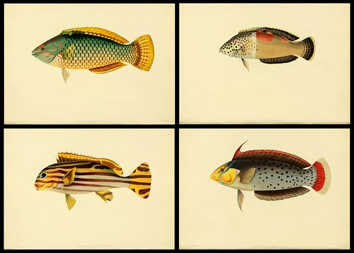
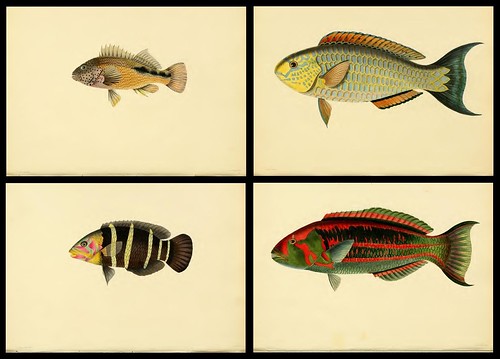
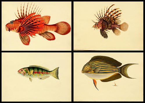
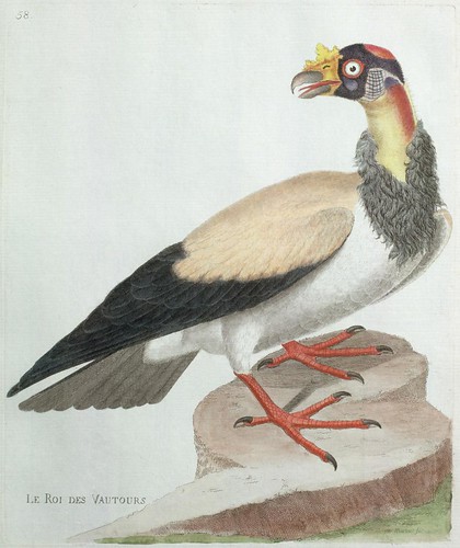
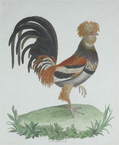
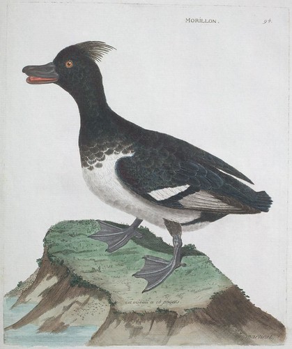
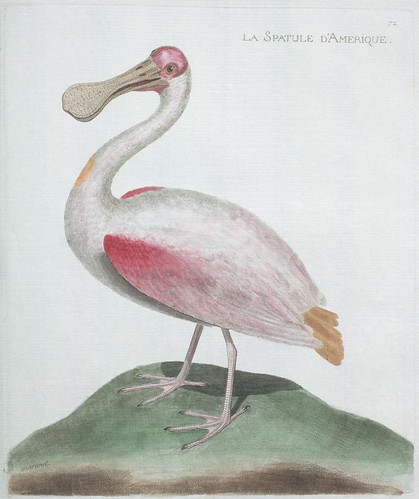
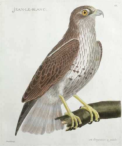
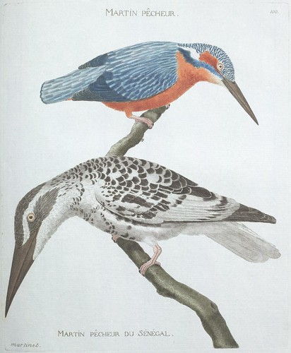
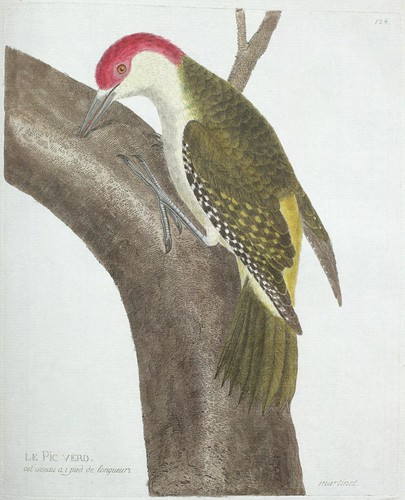
These stunning hand-coloured engravings of exotic fish from Sri Lanka (extracted from a .pdf) are from:
'A Selection from the most Remarkable and Interesting of the Fishes Found on the Coast of Ceylon from Drawings made in the Southern Part of that Island from the Living Specimens by John Whitchurch Bennett, 2nd Ed. 1834'.
The work contains thirty illustrations in total and the Harvard University edition is available at the
Internet Archive. (See related: html version of Tennant's
'Natural History of Ceylon' from 1861 - alas, the images are photocopy quality)
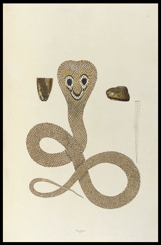
'Nagoo'
'An Account of Indian Serpents, collected on the Coast of Coromandel' by Patrick Russell, 1796. Russell was the botanist to the East India Company in Madras (Chennai). This is apparently the first book devoted to Indian snakes. The image, spliced together from screencaps, comes from somewhere in the Books, Manuscripts & Maps category at
Christies (inadvertently following from a comment by
Michael some weeks ago).
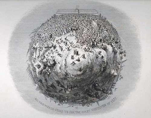
'All the World Going to See the Great Exhibition of 1851' by George Cruikshank.
"This image first appeared in Henry Mayhew’s
1851 or The Adventures of Mr. and Mrs. Sandboys and Family, Who Came Up to London to ‘Enjoy Themselves,’ and to See the Great Exhibition (London: David Bogue, [1851])."
[image and quote from
this entry - where there is more info. - at one of my favourite sites:
Princeton Graphic Arts Blog.]
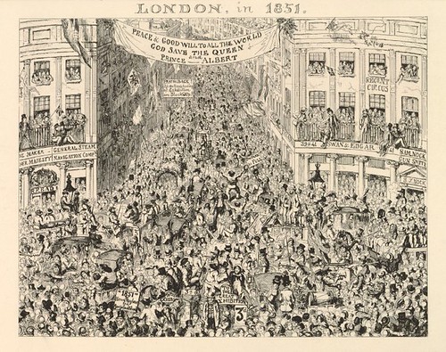
'London in 1851' by George Cruikshank.
View from the Circus looking up Piccadilly - Proof for an illustration to be included in:
'1851, or, The Adventures of Mr and Mrs Sandboys' by Henry Mayhew (from the
British Museum Prints Database)
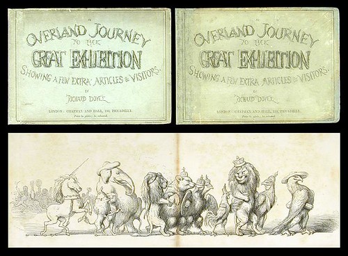
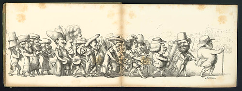 'An Overland Journey to the Great Exhibition. Showing a Few Extra Articles & Visitors'
 by (at one time) Punch Magazine illustrator,
Richard Doyle. The book contains no text and the satirical parade of humans and animals on their way to
Crystal Palace measured nine feet in length when all of the illustrations were joined together. The composite image is from
PBA Galleries and the second illustration comes from the
Great Exhibition Humorous Asides page at Kansas University's Spencer Library.
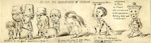
'The Arts and Manufactures of Ireland'
One of several designs for political caricatures on the Great Exhibition of 1851 drawn by George Augustus Sala (from the
British Museum Prints Database)
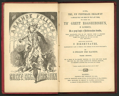
'O Ful, Tru, un Pertikler Okeaawnt o bwoth wat aw seed un wat aw yerd, we gooin too Th' Greyt Eggshibishun, e Lundun, an a greyt deyle of Hinfurmashun besoide' by Oliver Ormerod (penned under his Rochdale, Lancashire pseudonym,
Felley from Rachde).
"The title of the book (translated from the Rochdalian) is "A full, true and particular account of both what I saw and what I heard when going to the Great Exhibition, in London, and a great deal of information besides." (image and quote also from
Kansas U.)
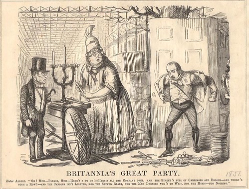
'Britannia's Great Party'
Punch Magazine on the Prince Consort and the Exhibition of 1851 (from
Victorian Web) [See also: Punch Magazine illustrations by John Leech:
Memorials of the Great Exhibition]
The prompt that made me look around for some satirical prints on the Great Exhibition of 1851 was receiving a (requested) copy of the catalogue (available online) from Melbourne's
Monash University Library exhibition (until August 31) - Fifty Books for Fifty Years. "This is an exhibition of fifty books chosen by Monash academics and researchers.[..] The fifty participants have chosen items they have consulted in the course of their work. The result is a fascinating variety of books, many of which have never been displayed." If not for the thousand-or-so kilometres, I would definitely go.
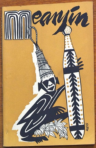
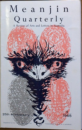
Speaking of Melbourne,
Sophie Cunningham is a publisher, journalist, writer and current editor of
Meanjin, an Australian literary and culture magazine established more than sixty years ago. Sophie has posted
a set of photographs of Meanjin covers to Flickr. Both the stylised Aboriginal figure in ceremonial
* attire and emu head cover illustrations above remain under copyright and have been posted here with permission.
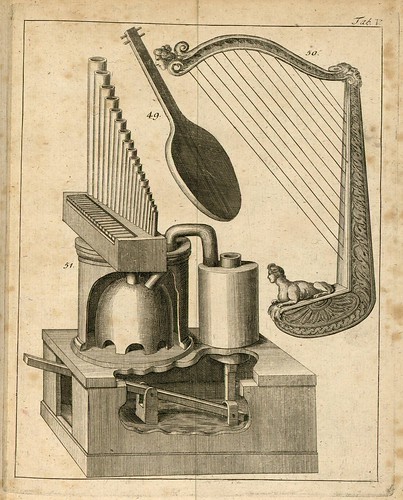
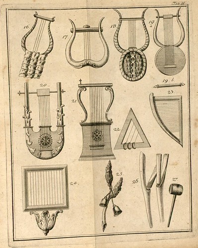
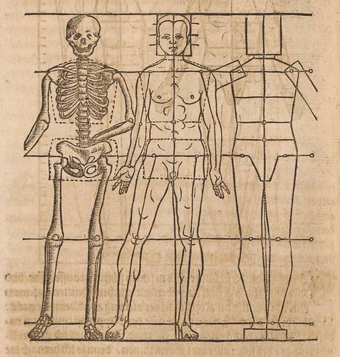
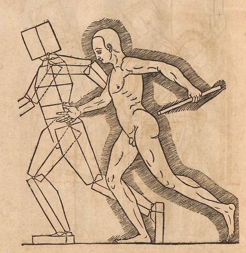
These engravings come from the first of Johann Forkel's ambitious 2-volume work,
'Allgemeine Geschichte der Musik' (General History of Music) [1788-1801]. These, together with a couple more similarly interesting illustrations can be found on the last pages of Tome I at
the Universities of Strasbourg Digital Library (very little of visual interest in Tome 2). I presume the schematic in the first illustration above is a pedal control unit for a pneumatic organ. It's too early for steam. Forkel was a biographer of Bach and is often regarded as the founder of modern musicology. He was never able to complete the planned third volume in the series so this first German attempt at documenting the history of music stops at the beginning of the 16th century. (See:
i,
ii,
iii)
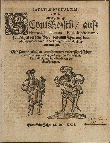
Titlepage from
'Facetiae Pennalium', 1622, by Julius Zincgref from
HAB. I know nothing about this book although I suspect it is philosophical in nature. Somewhere around I have a couple of links to
emblemata books by him which might materialise here in the future.
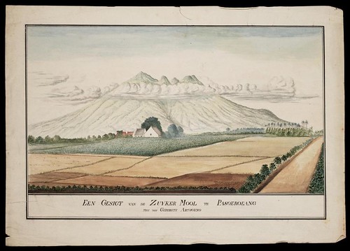
'Een Gesigt van de Zuyker mool te Pasoeroeang met het Gebergte Artjoeno'
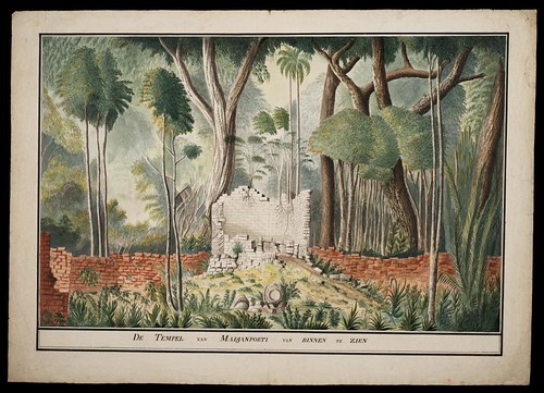
'De Tempel van Madjanpoeti van Binnen te Zien'
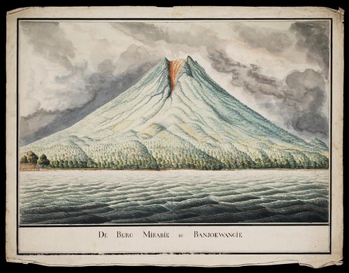
'De Berg Mirabie bij Banjoewangi'
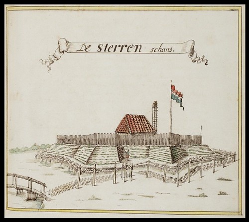
Batavia 1656
Despite the terrible rendering of online translation of Dutch, I'm fairly confident all four images above relate to the Java region of Indonesia and
are all* the first three are
approximately from the second half of the
17th 18th century
[*see the comments at the end of the post]. They are spliced screencaps from a new cartographic database of several hundred images relating to the Dutch East India Company (VOC). The collection consists mostly of maps (of course) - many fort outlines and lots of interesting and artistic map sketches - but there are the occasional scenic watercolour pictures as well. The material is hosted by the
Image Bank at the National Archives of Holland, accessible from the advanced search page. From the
'Collectie/Archief' drop down menu, select
'Kaarten van de VOC', change the number of thumbnails you want to display per page down the bottom and then hit
'zoek'. It's all easy. [
via/
via]
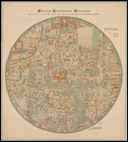
'Monialium Ebstorfensium Mappamundi'
This chromolithograph world map [spliced together from two sections] was made by Konrad Miller in 1896 and is a reproduction of a
mappamundi produced in Hanover (I think) in 1300. Although the largest version doesn't quite magnify all the details, it nevertheless remains an interesting map. Note that Christ's head, hands and feet mark the vertical and horizontal axes. The digital version is hosted by
MDZ.
Now, as I'm posting this entry, I've found
a decent write up at the Henry Davis site. They advise that the map - the German equivalent of the
'Hereford Mappamundi' - is known as the
'Ebstorf Mappamundi' (image) and was produced in 1234 by Gervase of Tilbury.
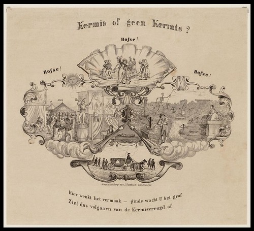
'Kermis of geen Kermis?'
[I think: Village Fair or Not?]
This lithograph, with it's unusual scalloped vignettes, was produced by Joseph Vürtheim sometime between 1843 and 1875. The print imagery seems to imply that village fair recreation will lead to death and despair. The image was spliced from screencaps from the
Amsterdam Archive Image Bank.
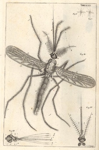
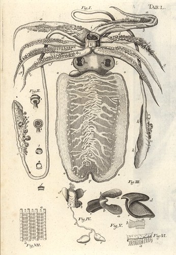
These fabulous squid and mosquito engravings come from Jan Swammerdam's classic
'Bibel der Natur' (1752).
The whole book is (finally!) online at Berlin's Humboldt University E-Doc server. (note the thumbnail link top left; the text may be photocopy quality but the engravings are great:
'Höhere Auflösung'=high resolution)
The Dutch microscopist, Jan Swammerdam, conducted groundbreaking research into the development of insects and made significant contributions to human anatomy and scientific methodology. (see:
i,
ii,
iii)

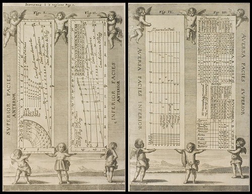
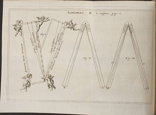
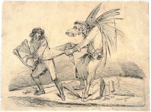
I jagged these odd engravings from
'Mathesis Caesarea' (1662) just because the idea of adding
putti (cupids) to an otherwise rather dry reworking of Albert von Curtz's
'Amussis Fernandea' by Gaspar Schott (the book being about mathematics, geometry and military architecture) seems amusingly incongruous.
The book is online at HAB. [Schott was assistant to Athanasius Kircher] See:
Polybiblio.
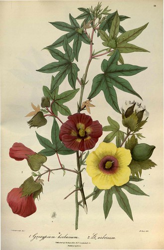
Gossypium herbaceum and Gossypium arboreum
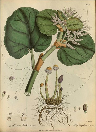
Rheum webbianum and Balanophora dioica
These plates (extracted from a .pdf) come from the beautiful book,
'Illustrations of the Botany and other Branches of the Natural History of the Himalayan Mountains and of the Flora of Cashmere' by J. Forbes Royle, 1839. The book was digitised by Missouri Botanical Gardens and is available through
the Biodiversity Heritage Library.
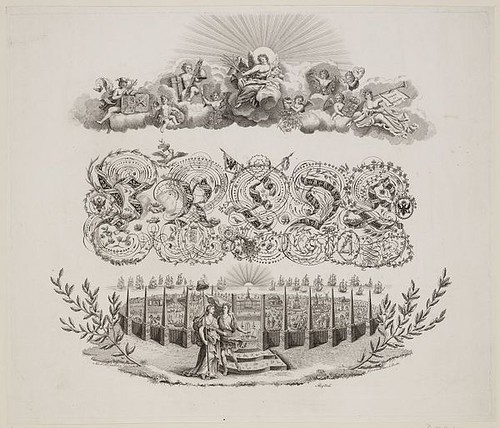
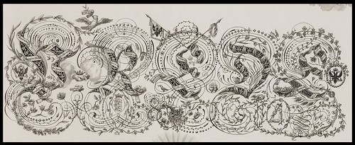 'Allegorie op de Vrede'
 (Allegory of Peace) is by A. Zürcher 1814 (not sure if there's any relationship to the engraver of the rabbits and mice satires up above). The main image is fairly small but I managed to cobble together a fair sized detail of the spectacular ornamental typography from screen caps.
This image comes from the Amsterdam Archive Image Bank and is definitely worth seeing in high resolution snippets within the constraints of the flash magnification box at the site.
'Zoilus' by Cyprian Norwid (search on his name at the
Polish Digital Library - they have a large number of his works. As previously noted, Matt from
Rashomon made
a beautiful five minute collage-film from a range of Norwid prints)
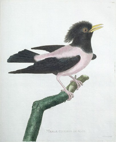
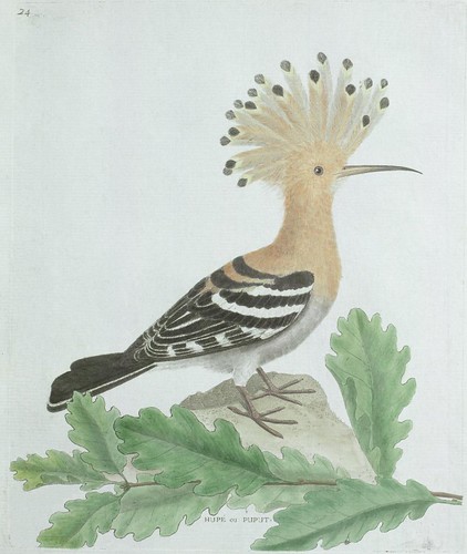
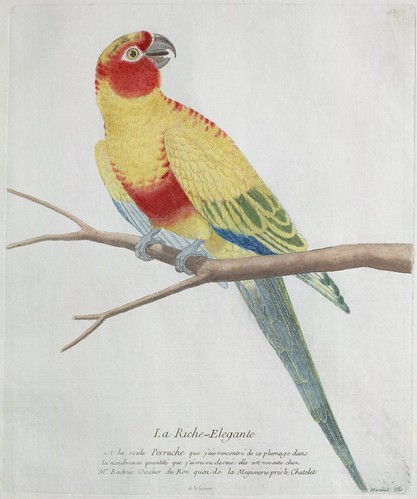
Many, but not all, of the above images have been spot or background cleaned as the mood took me. As usual, click through the images to flickr and then click 'All Sizes' for larger format versions.
The title of this entry - Multiplicity in Time and Space - was a phrase I first heard used years ago by a physician describing the unique profile of symptoms associated with Multiple Sclerosis (the syndrome erratically affects various parts of the body for varying amounts of time).
There is no intended reference here to MS
at all, but I've always thought it was an elegant turn of phrase and adequately describes the eclectic array of images above: produced by many people at different times in history and obtained from a range of sources. It was also the first thing that came into my head today when I was trying to summons forth a title.
More links?
Try the bookmarks.


